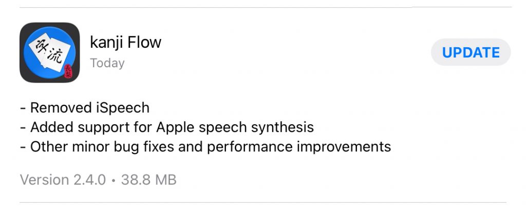
This update upgrades the base iOS version to 13.0 but users with devices running older versions of iOS can continue using an older version of the app which I intend to leave available for download.
Removed iSpeech
The iSpeech library hasn’t been updated in quite a while so it’s not compatible with the latest versions of iOS and had to be removed.
Added support for Apple speech synthesis
As a replacement, Apple’s own speech synthesis is utilized. It’s totally subjective, of course, but I think these voices sound about as good as the iSpeech voices. However, there may not be as much choice regarding accent and gender so you might get a male voice even if you have the female option selected depending on which accent you’ve requested.
It’s been quite a long while since the last release, a little over 2 years. I’ve just been terribly busy with a new job, a new wife, and a new son. I had been slowly working on a new update for that whole time but a few things kept me from getting to release. Mostly, I was trying to get the UI updated to work on all screen sizes and devices.
JiSeki app icon
I originally developed the base code for this app more than 10 years ago when the iOS SDK was first released back in 2008 (the first version of this app was called JiSeki released in April 2010 as my final project for college). At that time, there was only one iPhone with one screen size so, of course, I hard coded the UI to fit that screen. Then a phone with a four-inch screen was released so I added a bit of code to detect that and stretch things out a bit if necessary. Then the iPad was released so I added a bit more code to fit that resolution in portrait and landscape.
I realized when I was adding the four-inch code that it would probably be better to just refactor the layout code to just fit whatever the device resolution was. However, at the time it was a lot easier to just leave it alone and add a few exceptions where necessary.
I think it was around 2016 at WWDC that Apple began strongly suggesting that developers should start writing or refactoring code to dynamically layout on any resolution (adaptive layouts). This was because Apple knew they were going to start releasing a wider variety of devices with a lot of different resolutions with and without home buttons in addition to iPad’s multitasking features like split view and slide over.
However, I did not take the hint at that time. It wasn’t until iPhone X was released that it was obvious I would have to rewrite my UI. So, I started slowly working on storyboards using layout constraints in iOS 12. I was about halfway done during the last WWDC when Apple announced Swift UI. That seemed a lot better and easier to use than layout constraints so I decided to scrap what I had been working on and go with a new Swift UI instead.
Unfortunately, it turns out that while Swift UI is indeed great, it’s not quite feature complete and it would be pretty difficult to replace my full UI with just Swift UI. I’m hoping they’re going to add a lot of new features for iOS 14 which we should find out about at this year’s WWDC.
But, what to do about my current UI? Apple released some guidance this year which indicated apps that didn’t support every screen size would be…actually I’m not sure. Certainly they wouldn’t accept new apps or updates like that but I think they may have also been planning to boot current apps out of the store as well if they weren’t compatible. So that meant I had to get the app’s UI up-to-date before the deadline (which was fortunately extended to the end of June 2020, perhaps due to the pandemic).
I was kind of worried about how long it would take to get all the storyboards and constraints done but it turns out I really didn’t have to do that at all. I was just able to get rid of all (well, most) of my hard coded layouts and let iOS 13 handle most of it with my current xib files via a few auto layout tweaks.
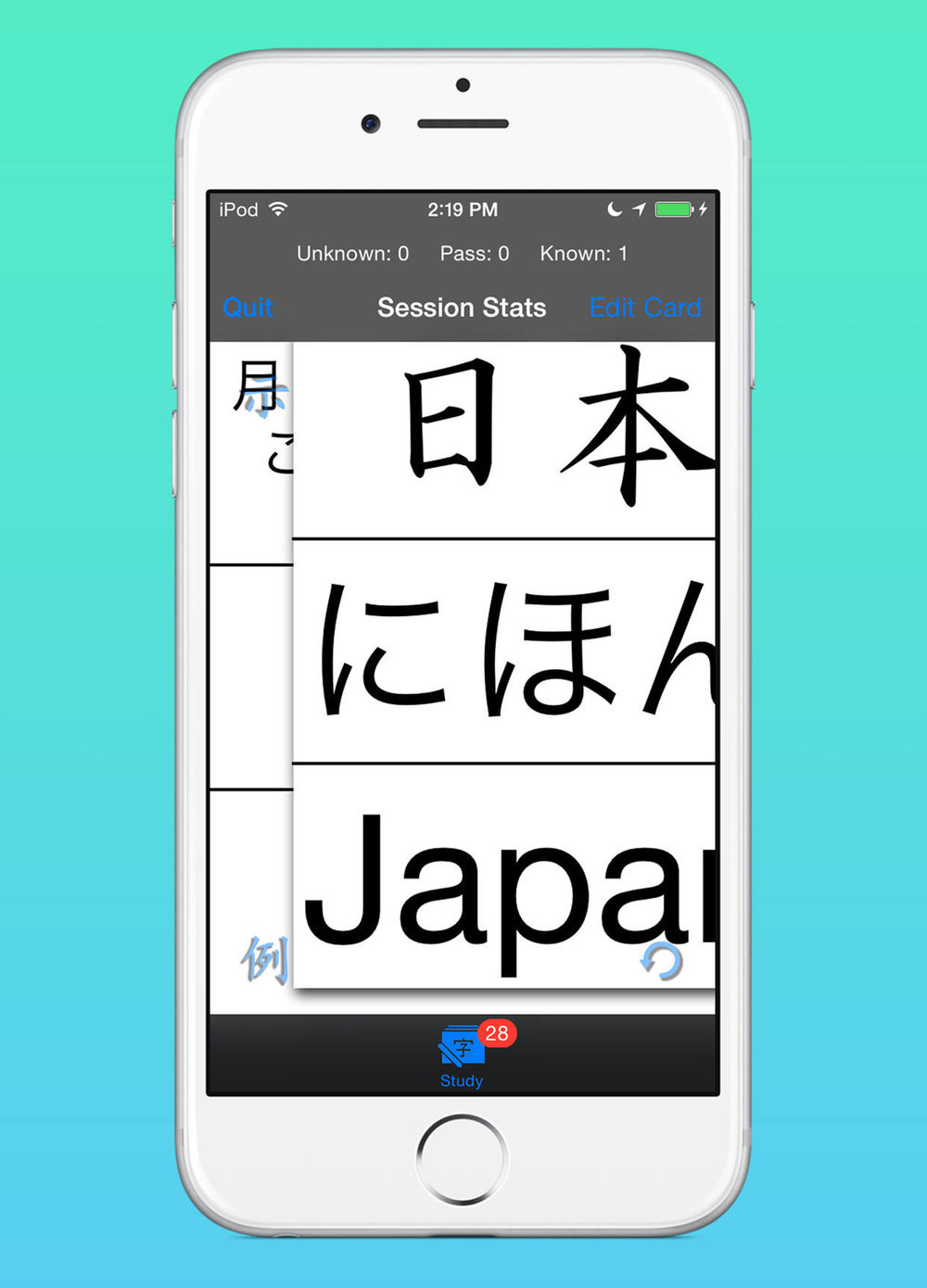
It’s not perfect (iPad only works in full screen) and I am still going to have to do a lot of work to get a fully modern, dynamic UI that supports multi-tasking on iPad OS and dark mode and dynamic fonts and on and on. But it fills the screen and finally looks good on notched iPhones and iPad Pros:
kanji Flow on iPhone 11 Pro & Pro Maxkanji Flow on iPad Pro 12.9″
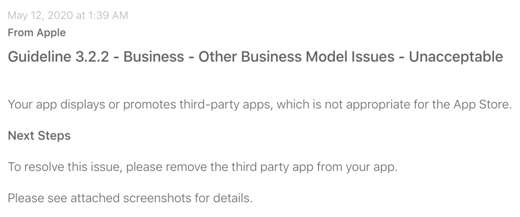
Another interesting or strange thing that prevented me from getting the update out as quickly as I wanted was some trouble with the app review process this time.
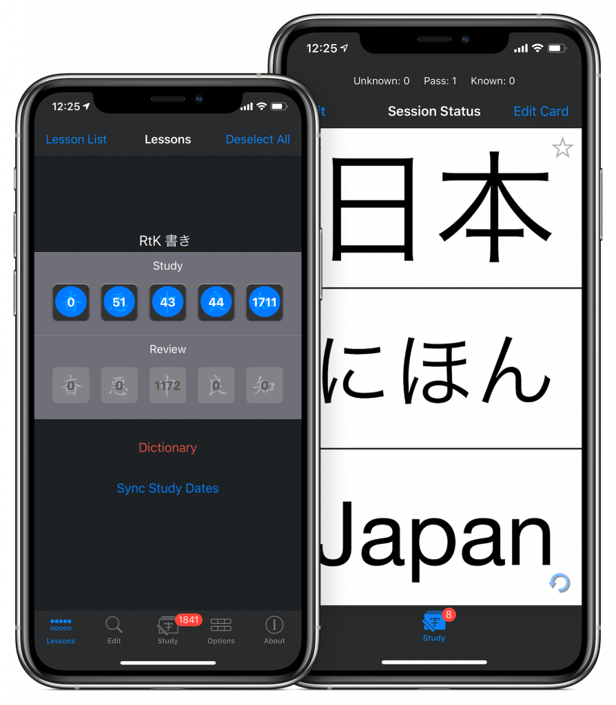
For some reason, Apple told me that I had to remove the third party app from my app. As a developer, this request didn’t make any sense to me. As far as I know, there is no way to put an app inside another. Of course, kanji Flow is integrated with imiwa? so that you can tap a button to do a dictionary search and things like that. But, imiwa? isn’t in my app. It’s just a link. When you tap it, you leave my app and imiwa? opens. So, I tried to get some clarification but they just said the same thing:
They included screenshots of my imiwa? buttons as well as the download link.
So, in the end I had to change the buttons to a generic dictionary label and, by default, those buttons open the Apple Dictionary instead of the much better imiwa? dictionary. If the dictionary buttons are blue, you know you’ll be getting the built-in dictionary which really isn’t so useful (and is actually kind of buggy and really slow to open in iOS 13; hopefully they’ll fix that in iOS 14). If you already have imiwa? installed on your device then the buttons turn red and you’ll continue to get the same functionality as before.
I guess for new users I just hope they’ll read the App Store text or visit this site to realize they can get a lot of convenient features by installing imiwa? and using that for dictionary lookups and card importing.
For the next update, I probably will be waiting until WWDC this June to see how far along Swift UI has come and hopefully I’ll be able to get the app’s UI fully modernized to work with iPad’s multitasking. I personally can’t wait until I can have the app open in side view on top of my sketching app so that I can do my study sessions with writing practice on a single device. Until then…
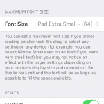
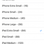
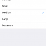
A user requested to be able to select a maximum font size so I’m working on adding the feature to the compatibility update I’ll release soon after iOS 11 launches.
This is what I’ve come up with so far:
The Settings app location and description
Available options
Full-sized text (no limit)
16 point font
40 point font
64 point font
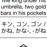
Another way to do this would be to select the font size by ratio instead of setting a point size. This results in a similar amount of padding in each field, but the actual font sizes will often be quite different:
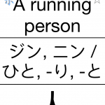
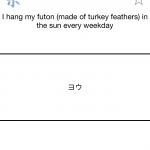
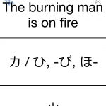
I got a very nice review for the app on May 1st from Jebi-sensei who mentioned some dissatisfaction with the way fonts work. You can turn off any fonts that you don’t like in the Settings app. If you turn them all off, you’ll get the system’s standard, sans-serif Gothic font.
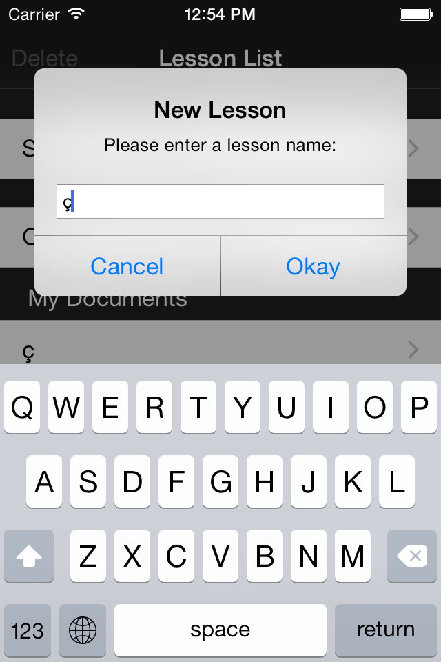
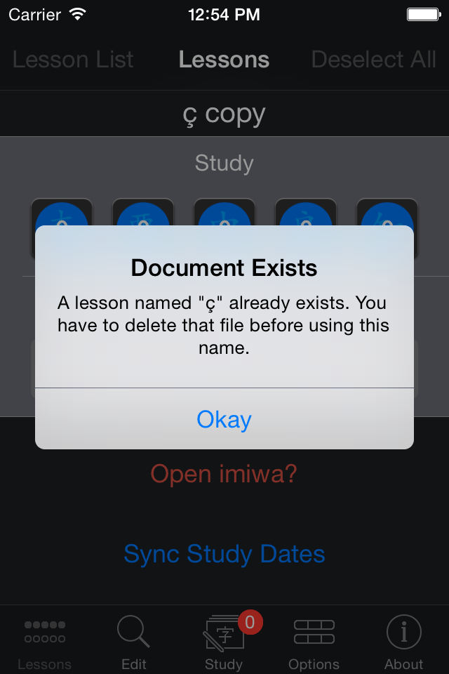
A user reported that he inadvertently overwrote one of his documents because he accidentally used the same name when creating a new lesson.
He was wondering why there wasn’t some sort of warning to prevent this.
I clearly remember writing quite a bit of code in order to stop this very scenario from occurring so I did some investigating to find out what the problem was.
I noticed that the user was using document names that had special unicode characters (in this case a ‘ç’) so I checked the documentation to see if there was anything mentioned. I use the standard isEqualToString: method to compare strings which does indeed clearly state:
The comparison uses the canonical representation of strings, which for a particular string is the length of the string plus the Unicode characters that make up the string. When this method compares two strings, if the individual Unicodes are the same, then the strings are equal, regardless of the backing store. “Literal” when applied to string comparison means that various Unicode decomposition rules are not applied and Unicode characters are individually compared. So, for instance, “Ö” represented as the composed character sequence “O” and umlaut would not compare equal to “Ö” represented as one Unicode character.
Whoops! I’ve switched over to using localizedCompare: so you can expect the app to properly check document names from version 2.2.6:
It’ll also check when renaming documents:
I’m really sorry for any trouble this may have caused anyone and I’m greatly appreciative of the user that reported the issue.
Please do continue letting me know if you notice any strange behavior and I’ll continue improving things.
iOS 8 was announced today. It has some new features that will allow me to implement some of the things I wanted to do in a much simpler way. So, I’m going to stop developing the new version that I was working on and go back to 2.1.2. I’ll release a small update to version 2.1.3 that contains some minor new features and bug fixes and then start work again on a big update to version 2.2.0 that will be released along with iOS 8.
I was planning to implement some sort of functionality to import or export Anki files. However, that was just going to be a temporary crutch to allow users a way to get at some extra content until I could get file sharing set up. File sharing itself isn’t difficult, but I would’ve needed to make a server available which wouldn’t have been so simple. I don’t need to worry about a server anymore and will be able to get file sharing working very quickly. So, I’m not so hyped about Anki files anymore. I know some people use my app only as a tool to export cards to Anki. Of course, that’s great and I’m glad you find that functionality useful but I’m not sure if I should spend time enhancing that versus using my time to actually make the app better. Thus, I might not add Anki importing and exporting after all. If you like Anki, you should just use that. I will consider feedback regarding this however.