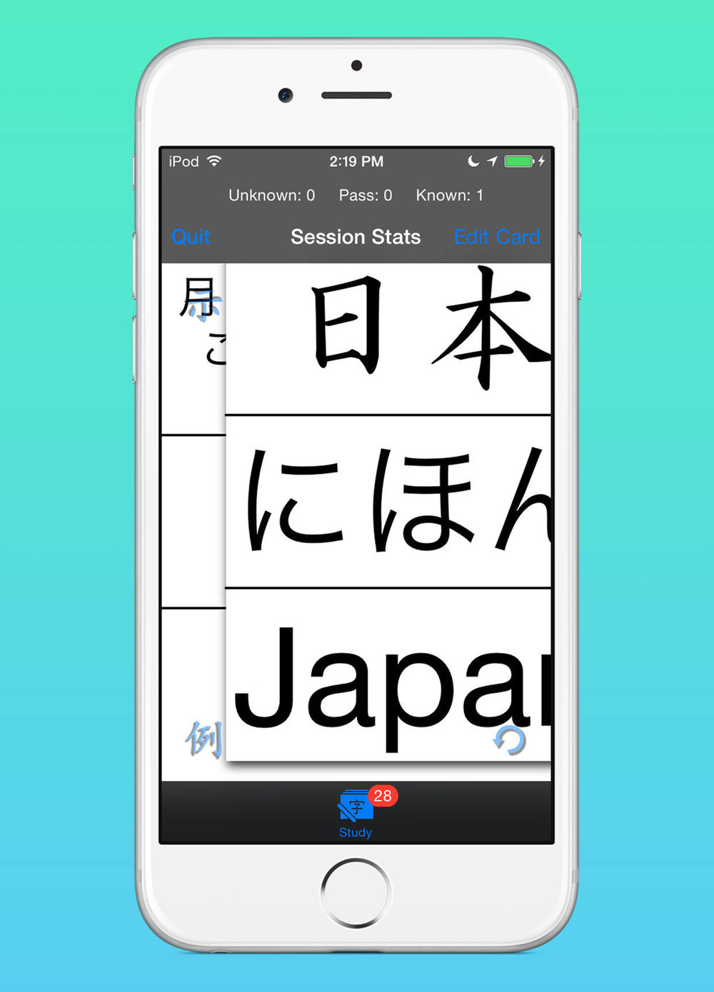
Version 1.06 went live in the store a couple of days ago. The main change was to the way the app lays out text. I tried to strike a good balance between having the biggest font sizes possible, layouts that are aesthetically pleasing, and performance.
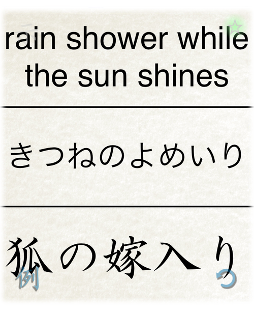
You now also have the option of putting in your own line breaks. You’ll notice some new buttons above the keyboard for moving between the different text areas when editing a card during a study session.

If you do put in your own line breaks, the app will choose the largest font available that respects the number of lines you wanted. However, the last line might still wrap again based on default wrapping if it’s too long and the font gets too small.
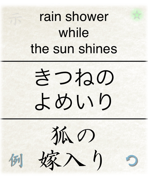
You can also use line breaks in your examples if you aren’t happy with the default layouts.
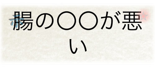
Some people might not like to have a single character on one line, so editing in a line break might make it look a bit better.

I’m prepping another update to guarantee compatibility with the newly released iOS 6.1 SDK and I’ll be addressing a new card sorting issue as well. Thanks for reading and be sure to let me know if you notice any issues with the text layouts.
Happy Studies!
