This, as well as part 1 and options info, is available as a PDF and can also be downloaded along with the 300 Kanji in 30 Days guide on Apple Books (free):
In this final post in the Options & Settings series, I’ll be going over the remaining settings available to you in the Settings app. Once again, the emoji labels will tell you if the setting affects the 🔍Edit view or 📝Study sessions, if applicable.
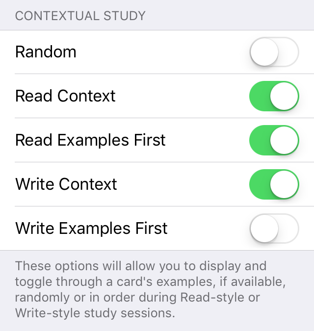
📝Contextual Study
What: Contextual means examples. So this set of options controls how you see examples during study sessions. Random makes your examples appear in a random order when you toggle through them. You can use Read & Write Context to turn examples on or off for read and write style lessons and Read/Write Examples First determines if your examples or the card’s normal entry appear first.
Why: This mostly comes down to personal preference about whether or not you want to see examples and, if so, if you want them to appear in order. The important choice might be the First switches in case you only want to see examples for cards that you need extra help with (turn them off) or if you’re systematically trying to study only using examples (turn them on).
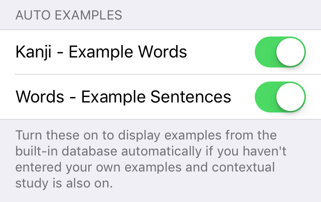
📝Auto Examples
What: If contextual study is on but you haven’t entered or selected any examples for a card, this will have the app display examples from the built-in examples database. If you have entered or selected some examples for a card, only your examples will be used.
Why: You might find the built-in examples words or sentences to be not very good or not well-suited to your purposes so you can choose to turn them off individually if you so desire.
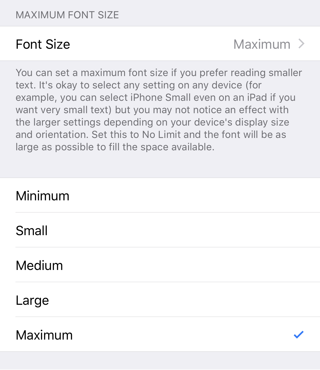
📝Maximum Font Size
What: The app will usually try to fill all the available space with a font that is as large as possible. You can use Font Size to set the font to be smaller if you prefer. Minimum is about a 16 point font and Small, Medium, and Large will give you 25%, 50%, and 75% of the normal maximum size, respectively.
Why: I would generally recommend leaving this set to Maximum but you can choose a smaller size if you prefer.
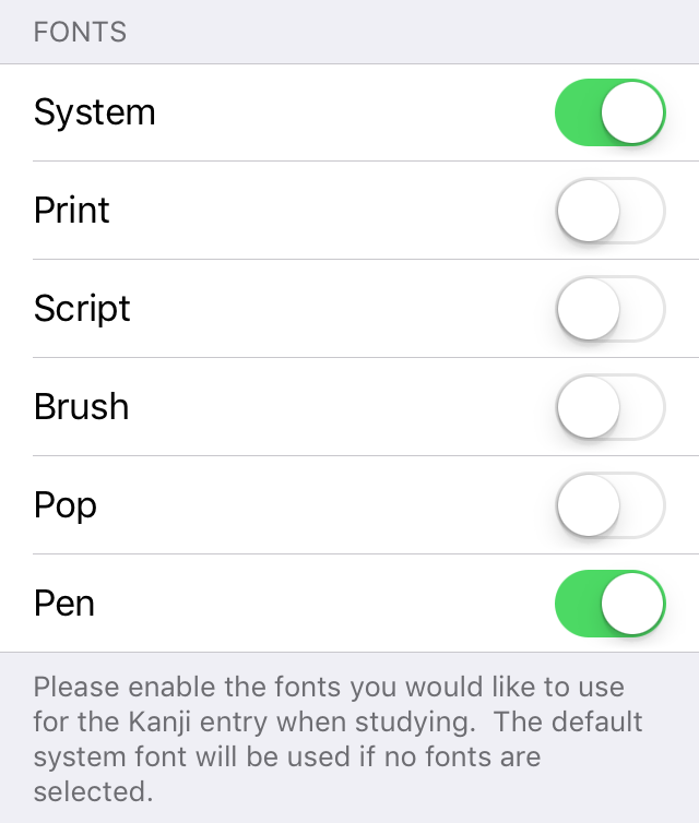
📝Fonts
What: There are a few different fonts you can use for displaying your card’s kanji entry during study sessions. The first three, System, Print, and Script are fairly representative of the classic styles of fonts normally used on computer systems and in print (sans, serif, and decorative). Brush is a calligraphy style font that can be quite difficult to read. Pop is a novelty font and looks similar to what is sometimes used in manga. Pen is a great font to copy if you’re trying to improve your handwriting. The system font will be used by default if none are selected and you can see the system font at any time by double tapping the kanji section of the card.
Why: You should probably just use whatever is most appealing to you. My personal preference is Pen and Brush can be good if you’re looking for a bit of an extra challenge. Turning on all of them will give you the opportunity to toggle through them at your leisure and might be good for seeing how some kanji have slightly different styles when written versus being displayed on a screen or in print.
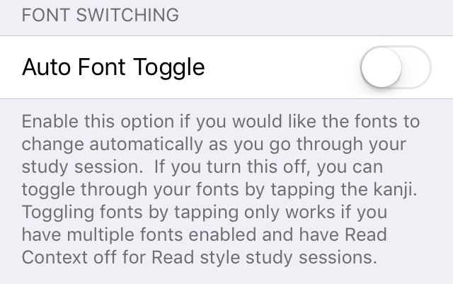
📝Font Switching
What: Auto Font Toggle will cause your cards to automatically switch through the fonts that you selected in the previous setting.
Why: I originally introduced this when I first added extra fonts to the app to show off that fact. However, it can actually be quite annoying if the fonts are changing when you don’t want them to so I defaulted this to off and you can use this option to turn it back on.
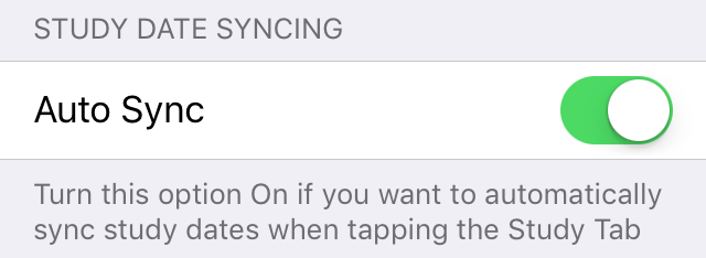
📝Study Date Syncing
What: Auto Sync will cause your cards’ study due dates to be automatically adjusted when you tap the study tab after missing out on studying for a few days. Sync basically just sets your oldest due date to today and then resets your other cards based on how many days they were due after that oldest date.
Why: It might be more convenient to turn this on if you often find yourself skipping study days. If you turn this off, you can still sync the due dates manually by using the button on the lessons tab.
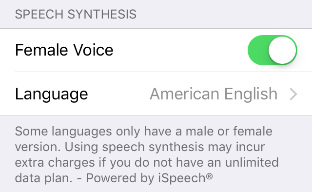
📝Speech Synthesis
What: These options allow you to choose what kind of voice and accent will be used when you choose the Speak option from the long press menu during study sessions.
Why: This all just comes down to personal preference depending on your native language and whether you prefer a male or female voice.
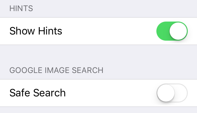
🔍📝 Hints
What: Show Hints will allow the app to show some alerts that might introduce new features to you from time to time.
Why: I make very limited use of this so I hope it never becomes too annoying. If you never want to see any unnecessary pop-up alerts of any kind then you can turn this off to prevent them.
📝 Google Image Search
What: This tells the app whether or not to include the safe search flag when doing Google image searches from the long press menu during study sessions. It’s important to note that even if you turn this off, your own Google account settings may re-enable safe search anyway if you have it turned on there.
Why: You can turn Safe Search on to help make sure you don’t see any NSFW images when doing an image search. However, knowing that a word might normally be associated with NSFW ideas could be useful knowledge when it comes to using Japanese in real situations so choose wisely.
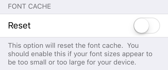
📝Font Cache
What: Reset will delete the font cache which tells the app how big to make fonts appear to fill the available space on your device.
Why: You should turn this on if you ever notice that fonts appear to be too small or too large so the app can try to recalculate the appropriate font sizes.
That’s it for the settings. Please be sure to let me know if anything wasn’t clear or if something doesn’t seem to work the way you expected or as described.
Happy Studies!
3 Replies to “Settings – Part 2”